

CH Media Publishing
A variable design system for 16 brands
How do you design for 16 different brands without creating 16 separate designs? As part of the redesign of CH Media’s regional news platforms, a variable design system was developed to centrally manage brands, viewports and modes. A system that does not just define visuals, but actively reduces complexity.
16 news platforms, different brand identities, varying requirements but only one technical foundation. What initially appears as diversity quickly leads to inconsistency, redundancy and high maintenance effort in practice. Changes need to be applied multiple times, design and development drift apart, and scaling becomes difficult.
The goal was clear:
👉 One system that unifies all brands without losing their individuality.
🧩 System Logic & Structure
Instead of designing individual screens, the problem was approached on a system level. The focus was on defining reusable logic that can adapt flexibly.
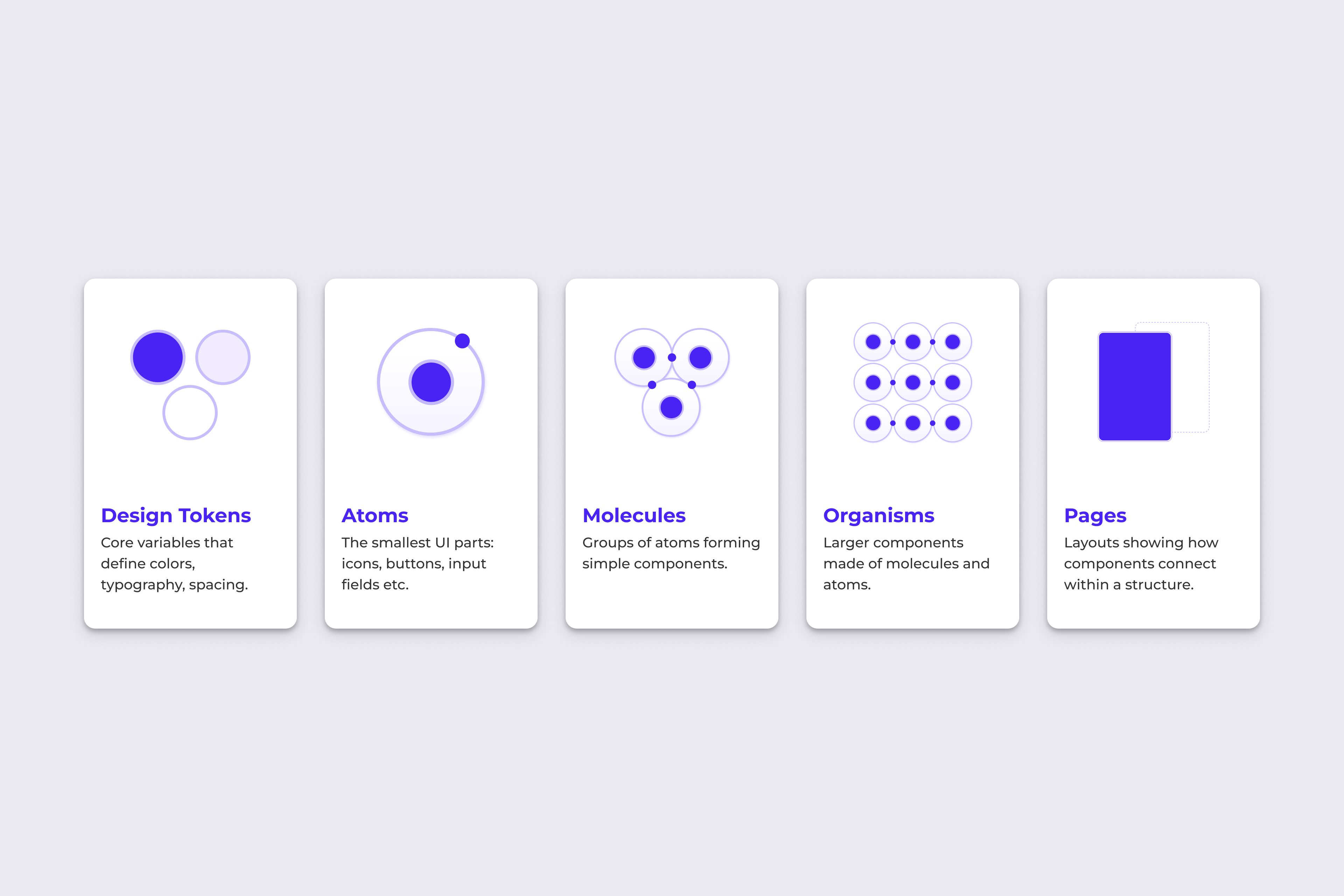
The design system is built on a token-based structure combined with a clear architectural logic inspired by Atomic Design. This creates a system that is both consistent in its foundation and flexible in its application.
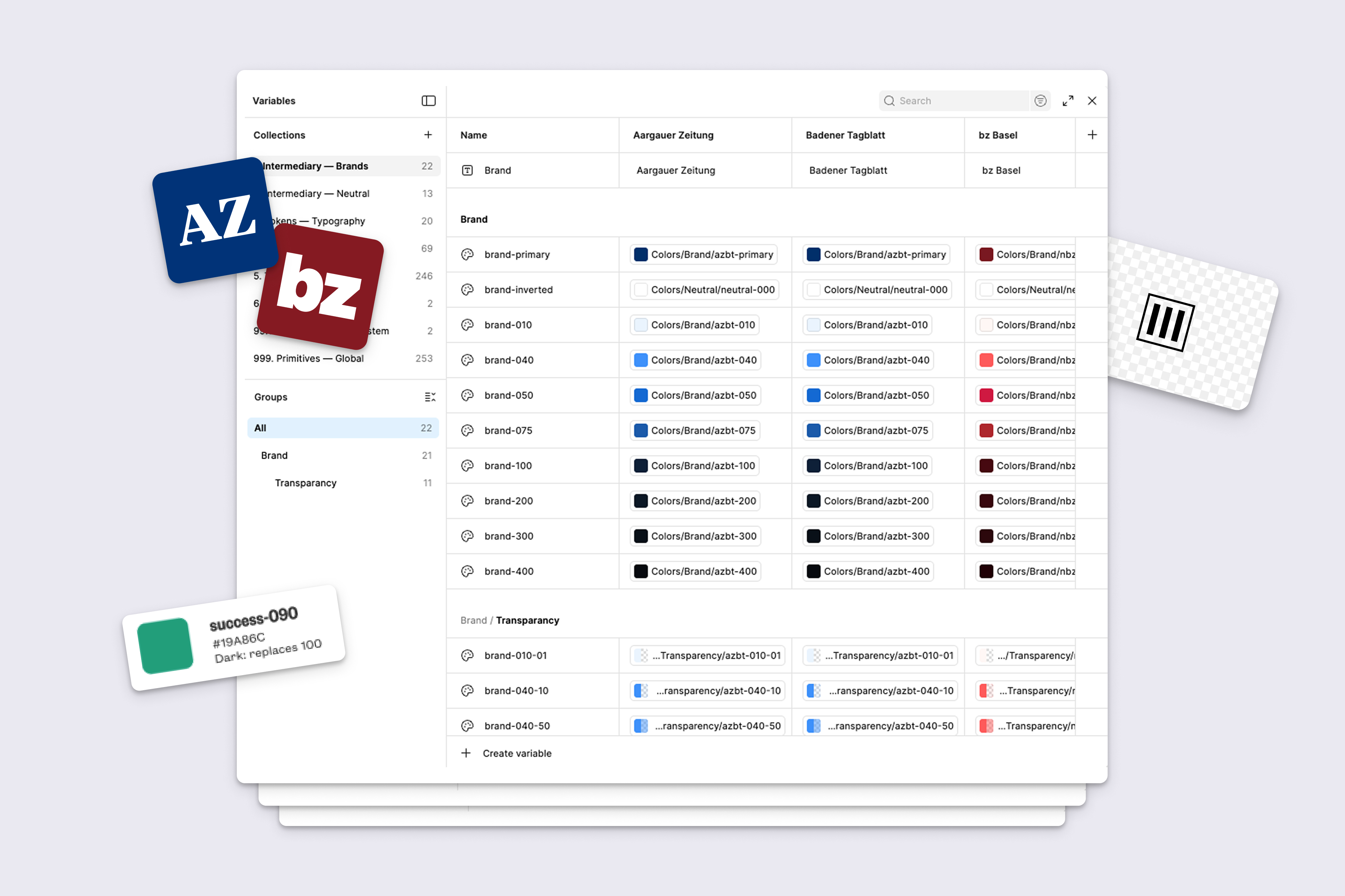
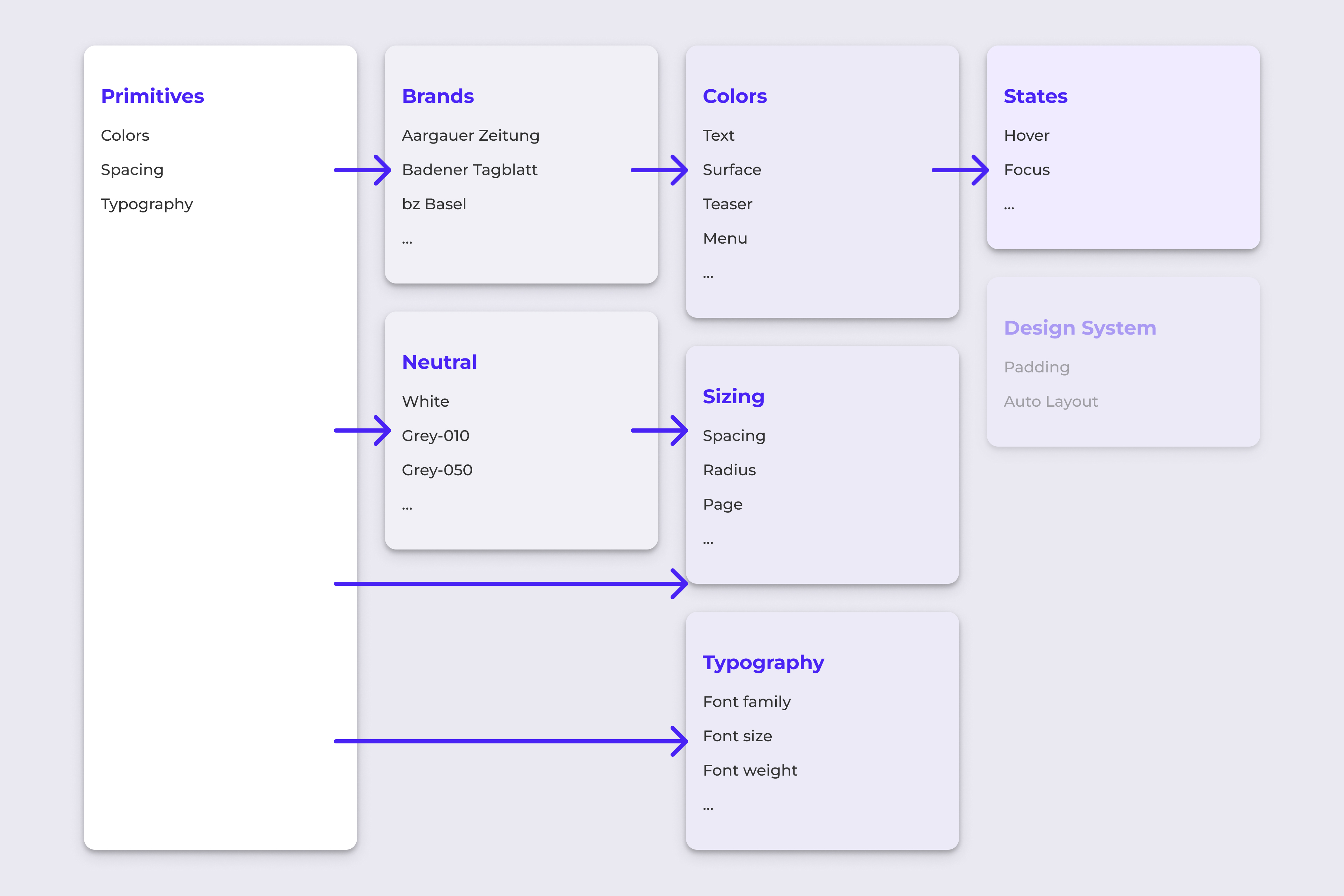
At the core of the system are design tokens. They define key variables such as colors, typography and spacing, and serve as a shared language between design and development. All brands follow the same logic – only the values change.
This structure brings clarity to the system and ensures consistency across all brands as the product evolves.
Variables – a System that adapts
The true power of the system lies in its use of variables. Nearly all properties respond dynamically to defined parameters.
What previously required manual adjustments now happens automatically within the system.
💡 With a single click, it is possible to
- Switch between brands (including colors, logo etc.)
- Adapt layouts to different viewports (change font-sizes and spacings)
- Toggle between light and dark mode
♻️ Iteration & Collaboration
The design system was developed iteratively across five sprints.
Each individual component was first designed and approved by various stakeholders, including editorial, product, and development team members. It was then developed, reviewed, and optimized step by step within the design system.
Technical feasibility was validated early on, and critical topics were aligned directly with development.
The use of tokens created a shared foundation across disciplines.
Design & Development Alignment
The system was built entirely in Figma, with a strong focus on token-based thinking. This made handover to development more efficient and ensured that design decisions could be directly translated into implementation.
Design and development did not work sequentially, but in parallel and in alignment. This ensured that the system remained both consistent and technically feasible.
💡 The result
A scalable, variable design system that unifies 16 brands within a single framework while preserving their individual identity.
- Consistent design across all platforms
- Significantly reduced maintenance effort
- Centralised and fast updates
- A stable foundation for future growth (e.g. for other departments)
🤓 Learnings
A design system is not a visual artifact, but a strategic tool.
The higher the complexity, the more important it becomes to establish a clear system that guides decisions instead of redefining them each time. The real impact lies not in individual components, but in the logic behind them.