Lämmli Architektur AG
Simplify is key
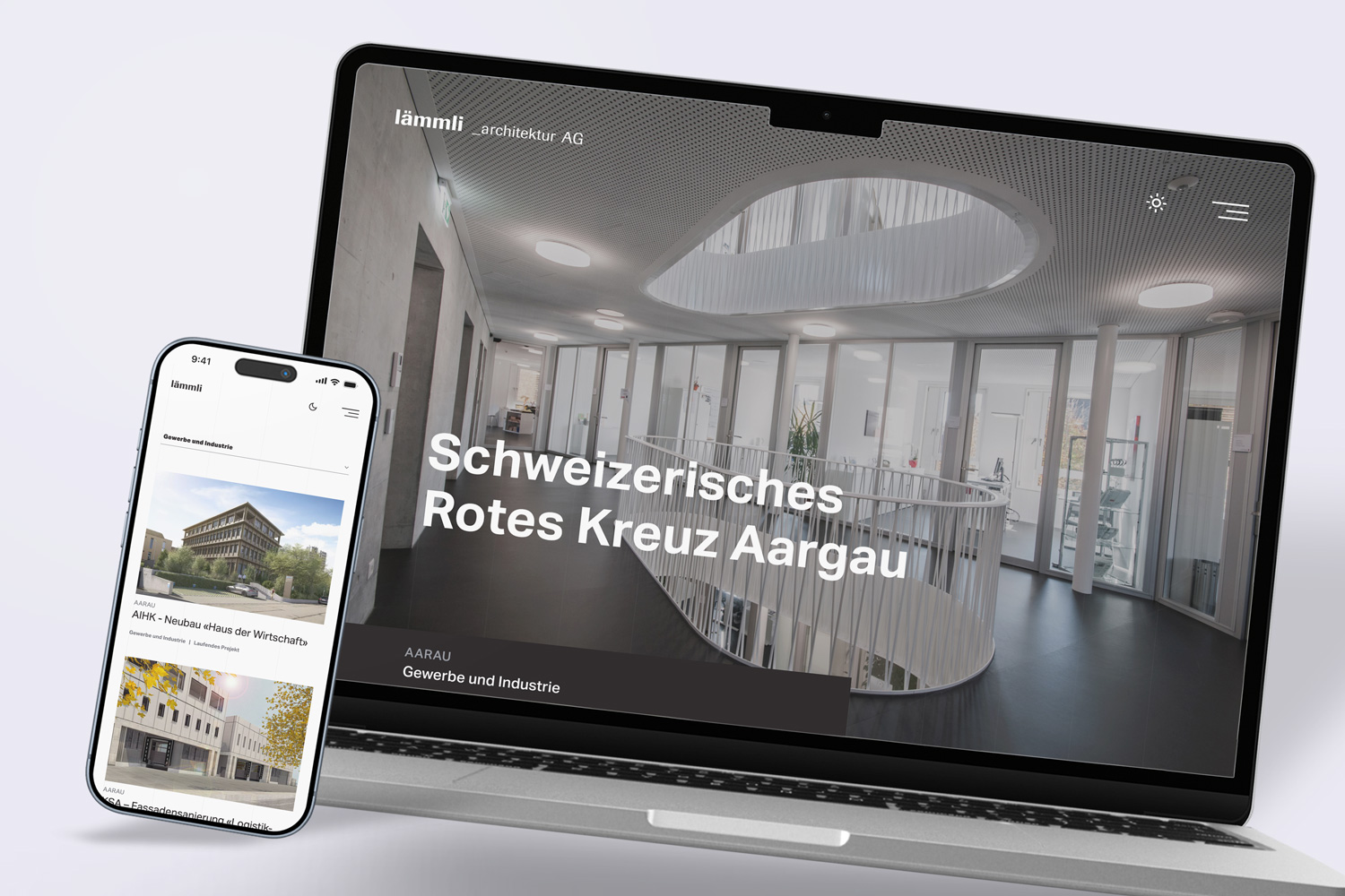
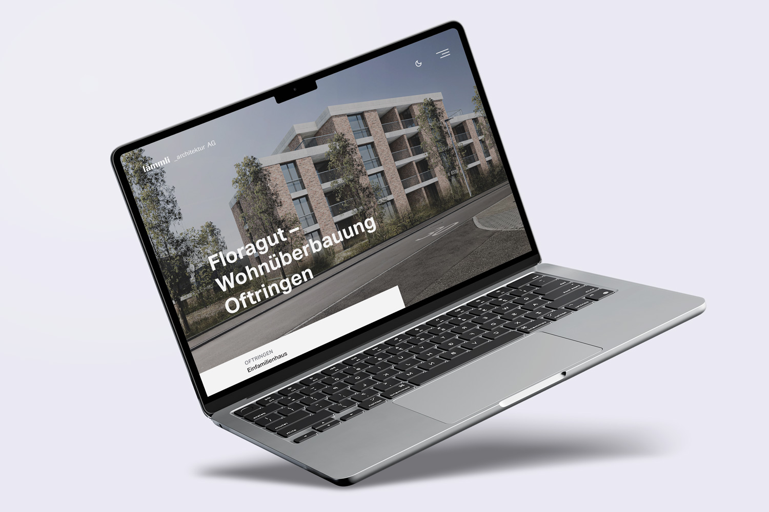
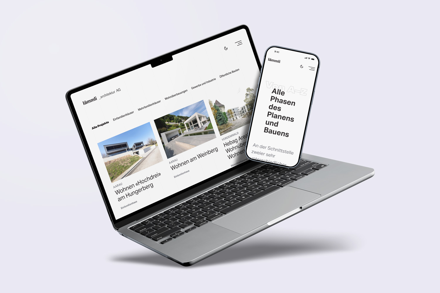
Reduction as an approach, typography as the primary medium: in a series of workshops, a website was developed that does not explain architecture, but rather brings it to life.
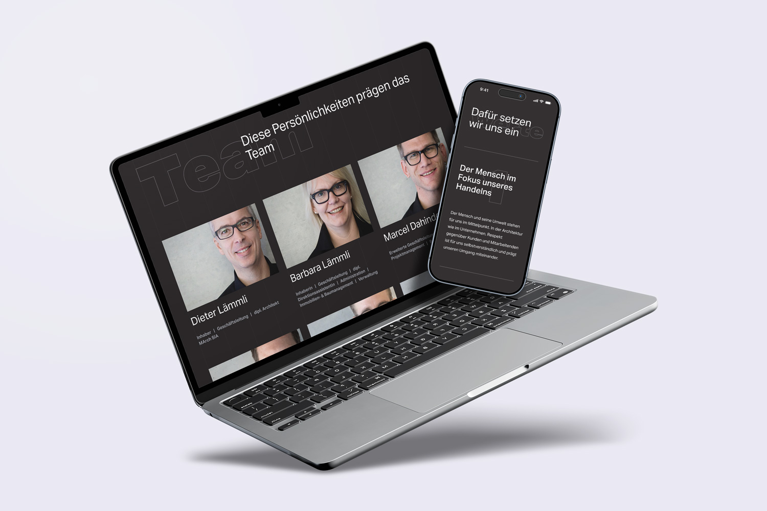
A clear grid, monochrome design, and a day-dependent light/dark mode logic convey attitude and quality, allowing the buildings themselves to take center stage.
For the family owned architecture company I created a storybased, typography focused, monochrome website, which should set the beautiful, luxury buildings in the right light. Everything is monochrome on the site expect of the images – that should help that the work get in the foreground. The faintly visible lines in the background shows the grid of the website and should also remind of architecture sketch plans.
In four different workshops the project manager and me created the concept step by step. We used a miro-board to analyse the status quo website, benchmark or to create some hypothesis and some wireframes.
A special feature i created with the dark-mode on a 'normal' website – which is not that common yet. The cool thing about it is, that it acts with the settings of your personal device. Which means, that if you set your device in the general settings in dark mode, the Lämmli website will appear in the dark theme and vice versa. Or if you set your device on the automatical change on timef the website will show up in the light theme during the daytime and in the dark theme during the night.