CH Media Publishing
New order
in the news stream
More features led not to better usage, but to confusion. Research involving 2'988 users showed why clarity is more important than variety and how a new navigation app and e-paper can be usefully combined to significantly increase engagement and usage.
🚨 (Business) problem(s)
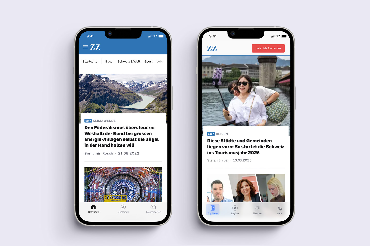
The existing app ecosystem suffered from fragmented navigation and overlapping entry points. This increased cognitive load, slowed down content access and weakened product clarity.
From a business perspective, this fragmentation also affected cross-product usage. Users consume news across apps and e-paper editions, yet the lack of a coherent structure created friction when switching between products. This directly impacted engagement, usage frequency and long-term subscriber value.
🔍 Research & Discovery
To understand user requirements from the user’s perspective, a quantitative survey was conducted. A total of 2'988 people took part in the survey, with a clear focus on our existing subscribers. Since they are the ones who mainly use the apps.
Of our app users also have installed the e-paper app.
Prefer the migration of news apps and e-papers.
Of subscribers surveyed are heavy users
These results confirmed that optimising the app primarily affects high-value users and that improving cross-product integration has clear strategic relevance.
Interviews
In addition, selected subscribers were interviewed using semi-structured in-depth interviews. The aim was to identify further, more detailed problems with usage. The focus was on clarity, features and usability. This allowed us to focus entirely on the needs of users when developing the new app.
The analysis revealed various pain points and opportunities for improvement, some of which have a direct impact on engagement and retention.
💡 Key Insights
- Too many different navigation options. Some of them reached the same endpoints, but were more confusing than helpful.
- Regionality is the main reason for using our products. And secondary use after accessing the site via the home page.
- Topicality of the news is most important.
- Author information matters, as users recognise and trust known editors
✨ Ideation
In a collaborative workshop with team members and subject matter experts, creativity techniques such as «Crazy 8» were used to generate initial ideas. These ideas later served as the basis for prototyping and the design phase.The goal was to simplify navigation, better integrate the e-paper and strengthen features that users already value.
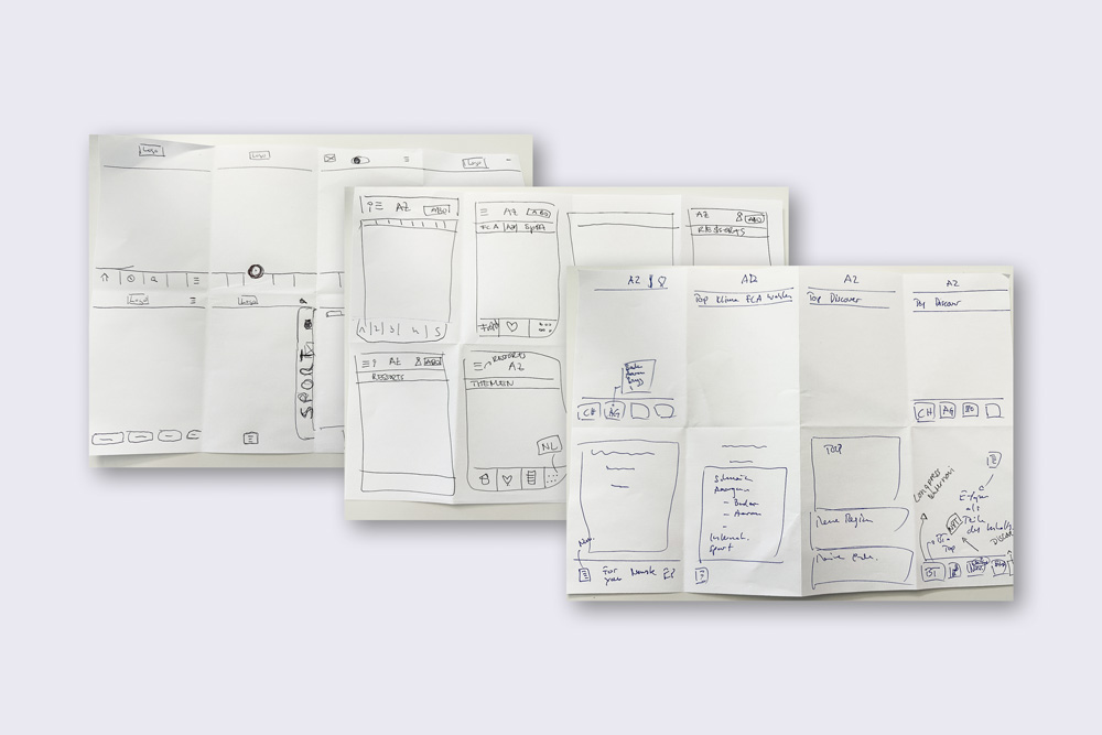
🔄 Validation & Testing
User tests were conducted to gather feedback on the overall product concept of the optimised news app. A design prototype was used to validate user needs and to collect qualitative feedback on the improved user experience.
The tests focused on:
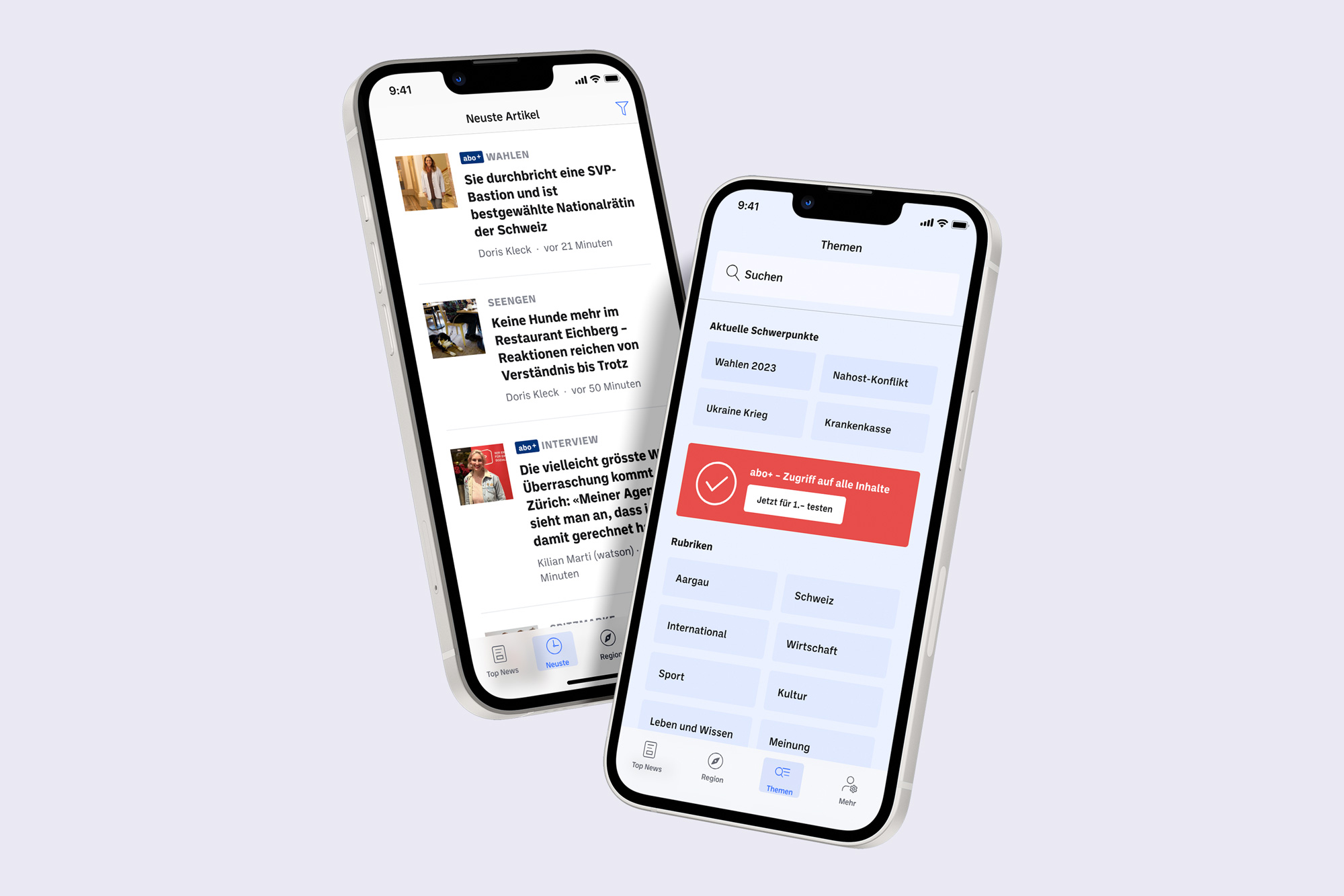
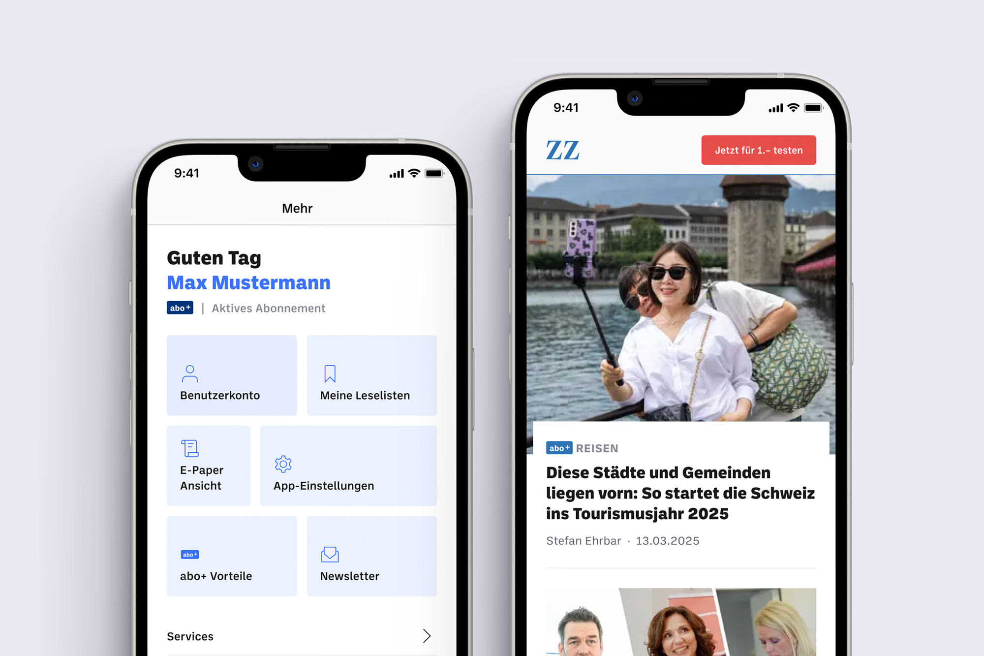
- Comprehensibility of the new navigation concept, including migration with the e-paper, topics and additional sections
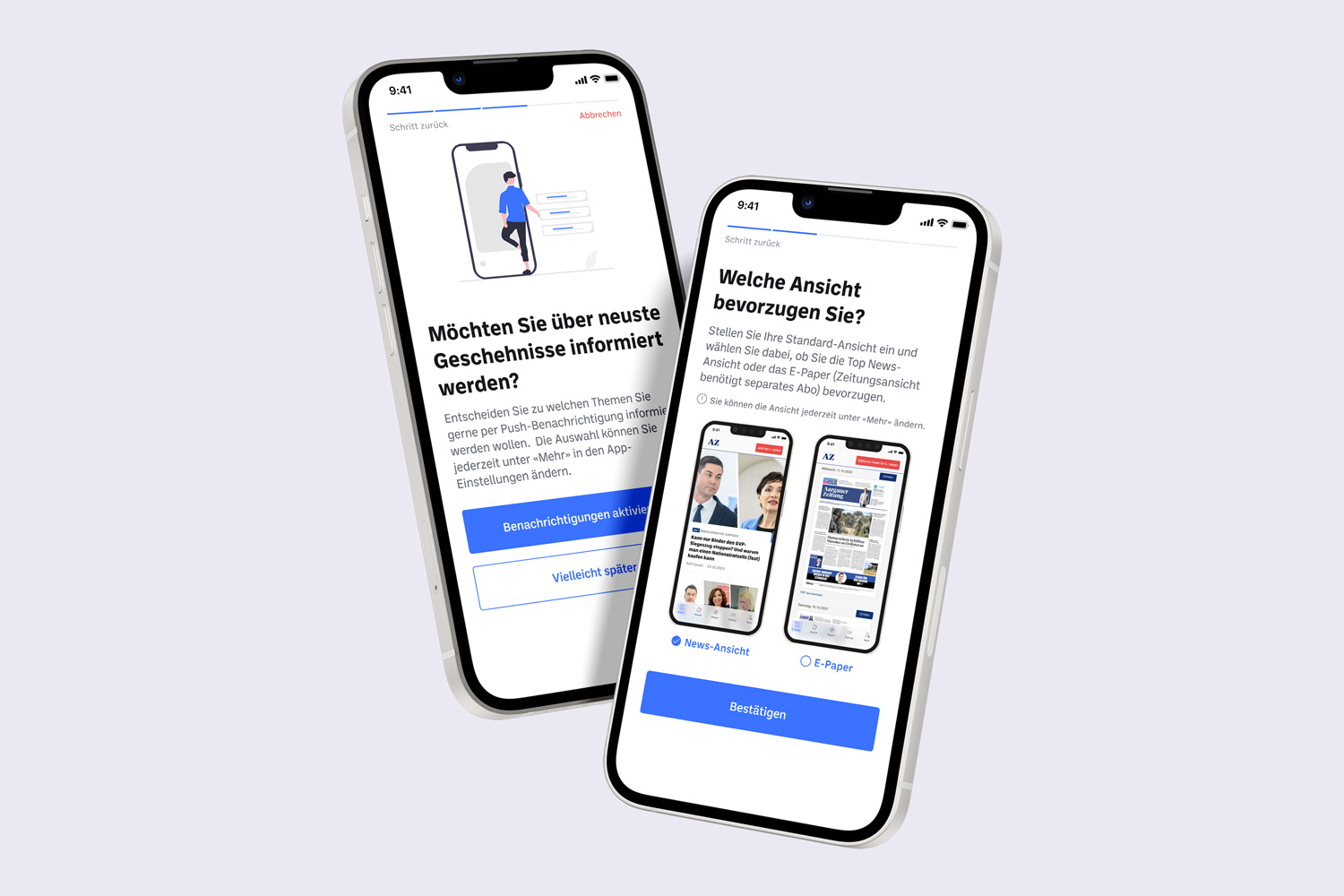
- The setup wizard
- The new «latest» feature
- General user feedback as basis for the final design
🚀 Solution
The research-driven process resulted in a clearer and more consistent navigation concept that better reflects user expectations and usage patterns. The optimised app structure supports faster access to relevant content and strengthens the connection between news app and e-paper as well as user engagement time.
User feedback from testing directly informed the final design and ensured that the solution was aligned with real user needs.