

CH Media Publishing
Bolder and stronger regional identity
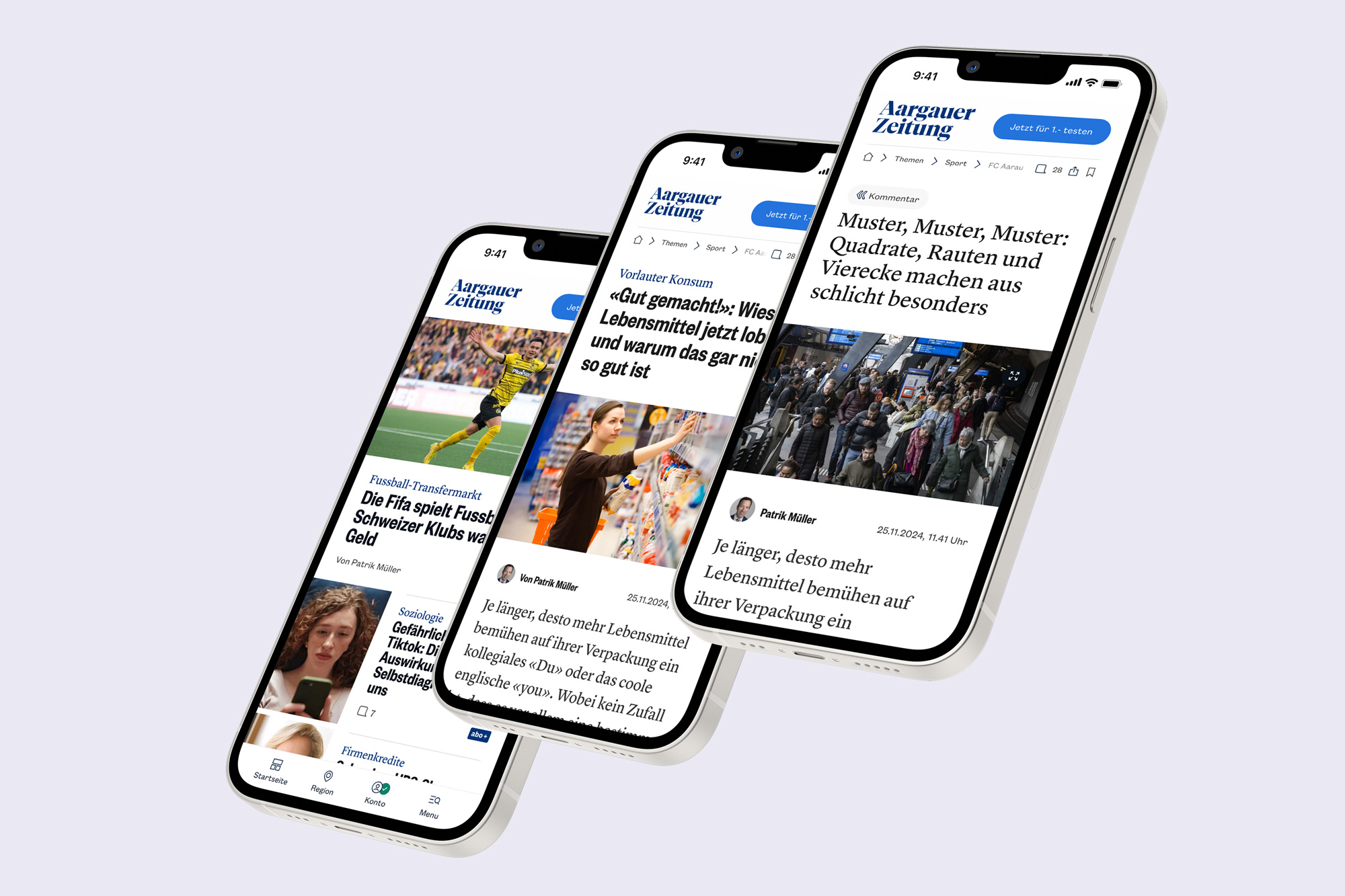
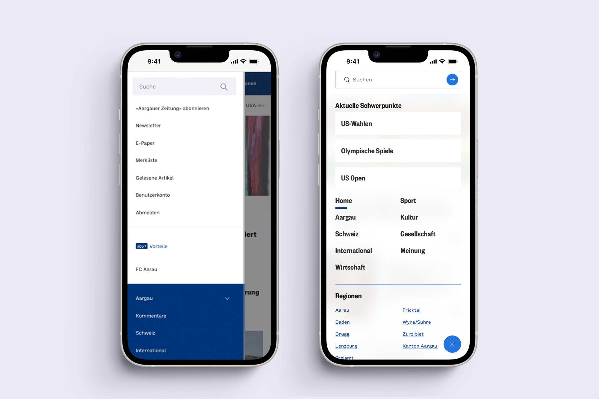
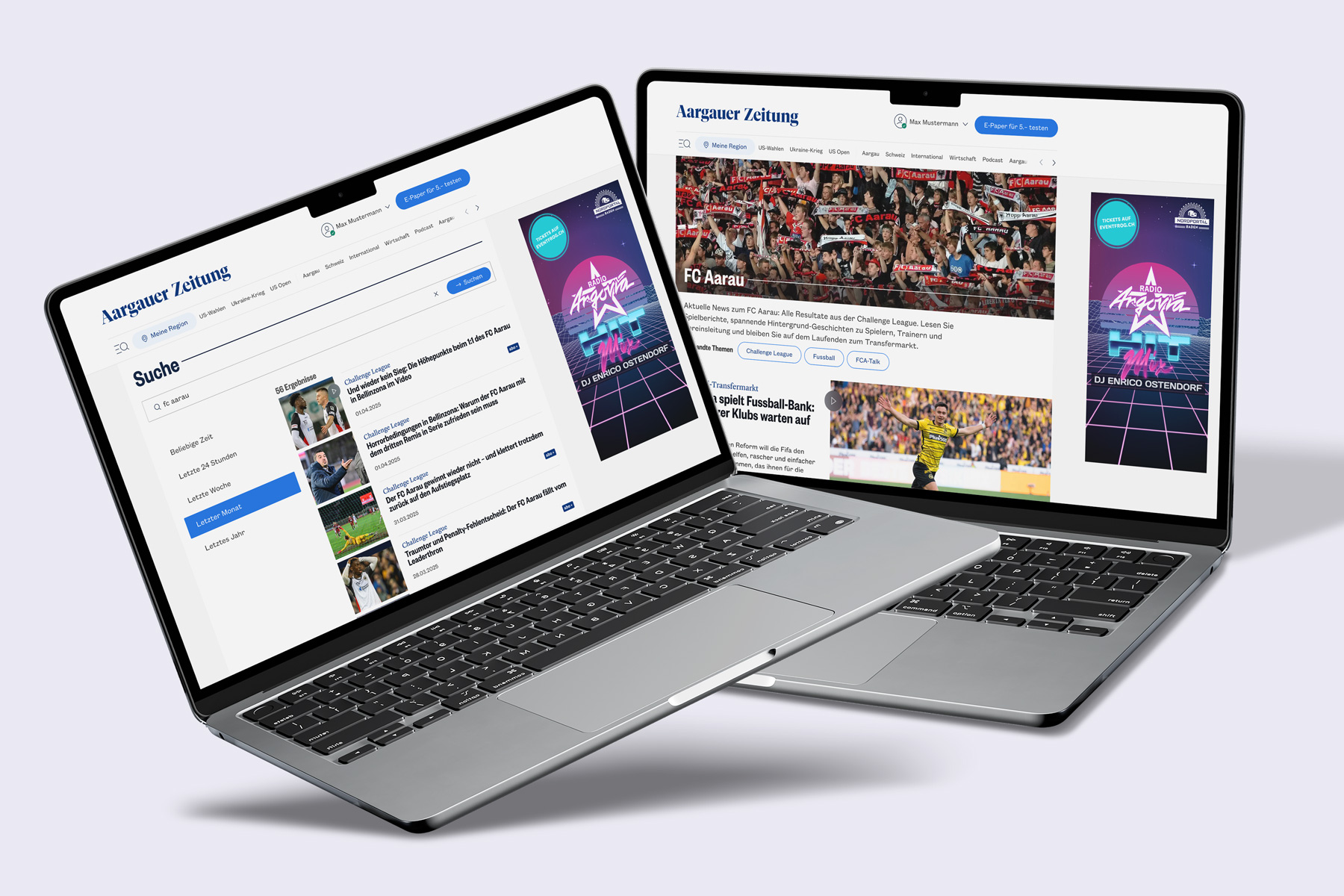
As part of a migration project at CH Media, an opportunity emerged to not only modernise the technical foundation of the regional news portals, but to rethink them conceptually and visually at the same time. The goal was to redesign all 16 news platforms and create a scalable, future-proof design system as a shared foundation.
CH Media operates 16 regional news platforms across the regions Nordwest-, Zentral- and Ostschweiz. While all platforms were built on the same technical framework, they previously differed mainly through their individual brand colors.
The upcoming migration created a rare opportunity. Instead of simply transferring existing structures, the redesign was used to establish a more modern, bolder and stronger visual presence. At the same time, the new design was expected to better support business goals such as user engagement, time spent on site, daily visits, subscriptions and advertising models.
The core challenge was to unite 16 brands with strong regional identities within one shared (design)-system, without losing their individuality.
🔍 Research & Alignment
User Surveys
Ahead of the design phase, user surveys were conducted to identify the main pain points of the existing platforms. Repeated feedback highlighted unclear homepage structures, difficulties in finding regional content and visual overload caused by missing hierarchies.
These insights formed an important foundation for all conceptual decisions that followed.
(Inhouse) Stakeholder Interviews
In parallel, inhouse interviews were conducted with a wide range of stakeholders, from editors-in-chief and product owners to technical leads, marketing specialists and the chairman of the board.
The goal was to capture different perspectives and expectations, consolidate them and align them into a shared vision. This phase was essential in positioning design as a connecting element between business, editorial and technology.
💡 Key Insights
- Establish a more modern, bolder and stronger visual presence
- Reduce visual overload
- Increase user interaction, time spent on the website, daily visits, subscriptions
- Improve unclear structure and regional content findability
✨ Exploration & Ideation
Typography
The design process deliberately started with exploring the look and feel through typography. Type plays a central role in journalistic products and strongly influences readability, tone and perception.
A wide range of typefaces was tested, from grotesque to serif styles, across different weights and combinations. The aim was to find a typographic voice that feels modern, remains credible for journalism and works consistently across all brands.

Once the main typeface was defined, a clear typographic hierarchy was established. Headlines, subheadlines, teasers, meta information and body text needed to relate to each other in a consistent and logical way.
To ensure scalability and consistency, a mathematical formula was defined that governs how all text styles scale in relation to each other. This ensures a stable hierarchy across viewports and brands.

Colors
The existing brand colors of the individual titles were taken as a starting point. At the same time, the system had to accommodate 16 brands across six different color families, ranging from multiple shades of blue and red to black.
According to the briefing, the new visual appearance was meant to feel bolder and fresher. As a result, color was given more visual weight and used more consciously as a design element.
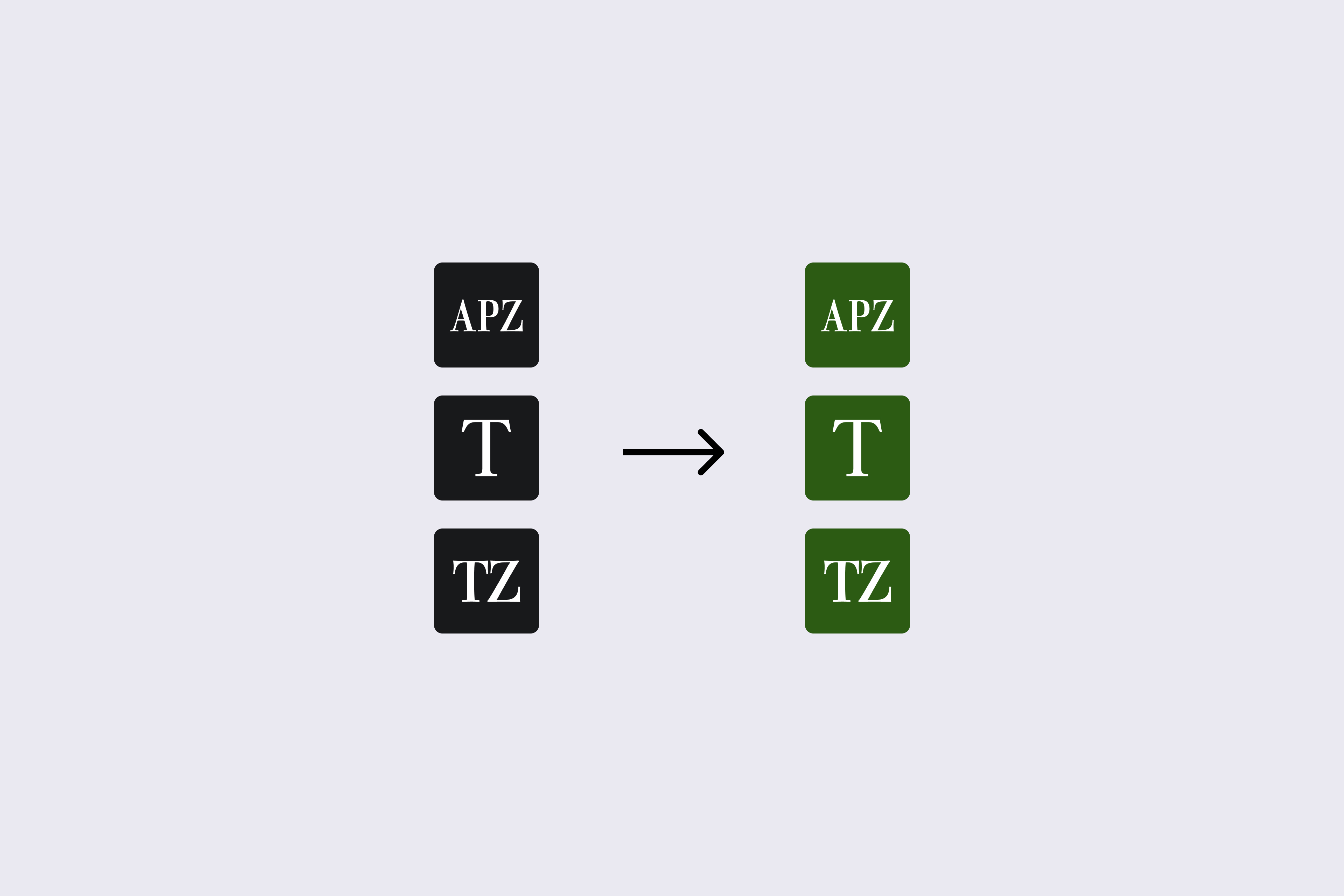
For the Ostschweiz, whose platforms previously relied solely on black as a brand color, a new regional color was introduced. After testing, a dark moss green proved to be the best choice. Green is strongly associated with the region and was still unoccupied within the brand landscape. At the same time, care was taken to avoid similarities with typical success greens to prevent misinterpretation.
Stronger Color Usage & New Accents
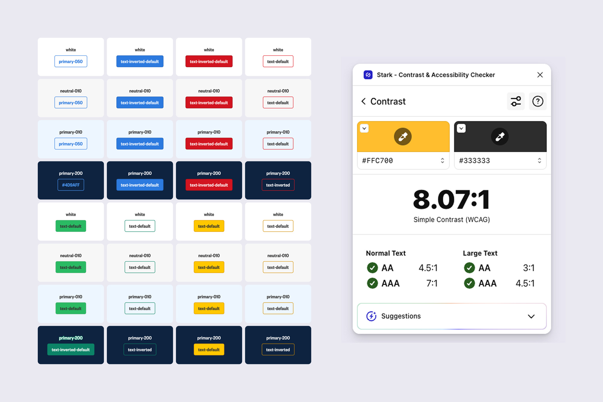
It quickly became clear that brand colors alone were not sufficient. They were therefore extended by a palette of tonal variations. To ensure consistency and maintainability, a system was defined in which all shades are automatically calculated from the base brand color.
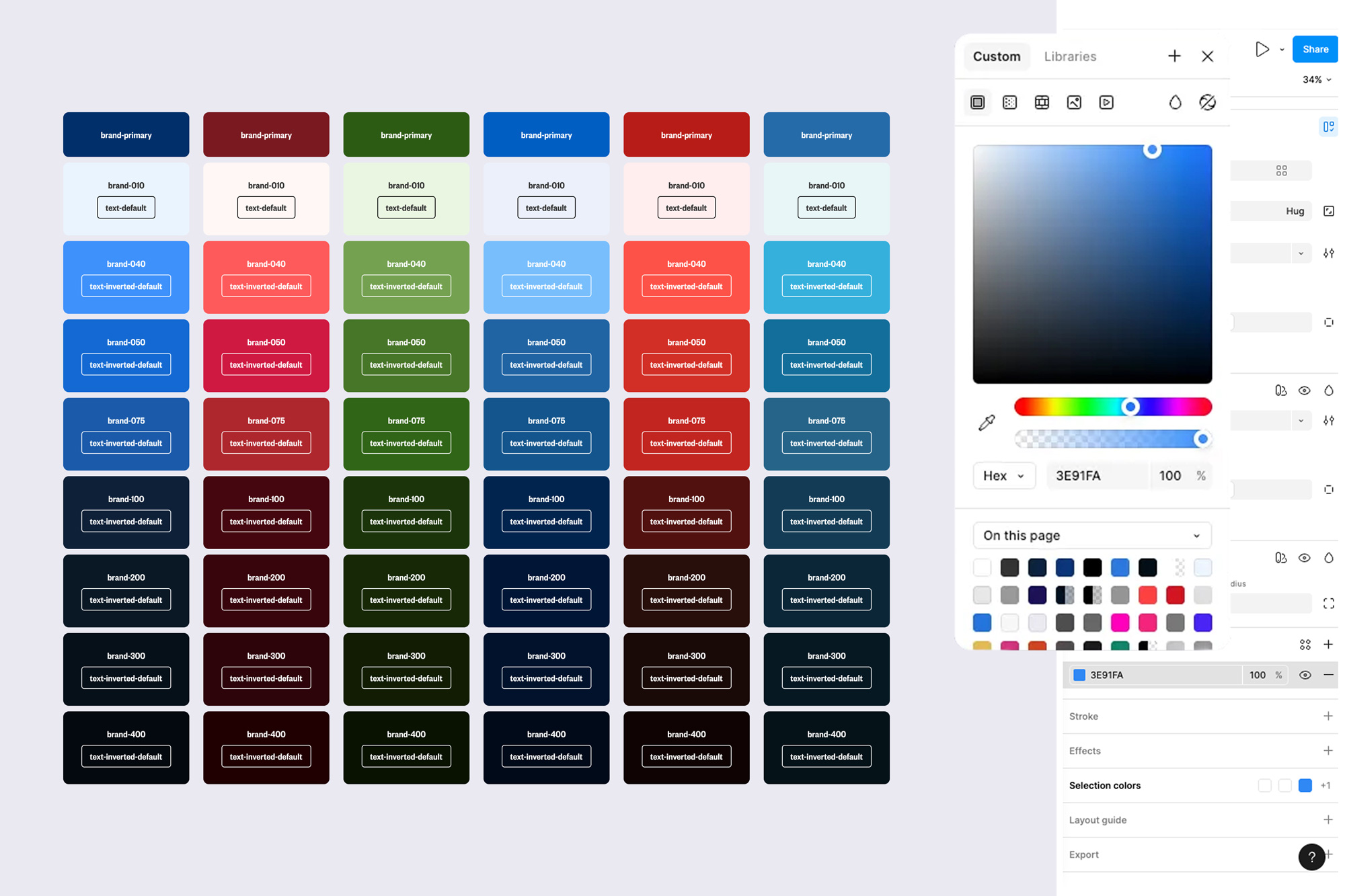
All color combinations were then tested extensively for contrast and readability to ensure accessibility across different contexts.
🚀 Finalization & System Design
Once the visual foundation was established, the focus shifted to system design. Over five iterative sprints, individual components were developed, reviewed and refined step by step.
A core project team worked closely together, while results were regularly presented and discussed within an extended group involving editorial, product, technology and marketing. Approved components were finalised directly within the new design system.
Variable-Based Design System
The design system was built as a variable-based file. Almost all key parameters, such as typography, spacing, colors and logos, are controlled through variables that adapt depending on viewport and brand.
This approach proved to be a real game changer, especially with 16 different brands within one system. Changes can be applied consistently and efficiently without manual adjustments across multiple files.
Starting from atoms, the system gradually evolved into molecules, organisms and finally fully developed demo pages that demonstrate the system in real-world scenarios.
